Deadlock In-Game Assistant
a contextual interface overlay that turns overwhelming match data into clear, immediate tactical actions.
project type
Case Study
year
2026
my role
UX Researcher/UI Designer
client
UC San Diego
project overview
every competitive gamer knows the frustration of hitting a skill wall. you finish a long, stressful match, want to figure out why you lost, and find yourself staring at a wall of numbers that don't make any sense. in valve's deadlock, a complex, fast-paced hybrid moba/third-person shooter, this problem is magnified. the game tracks an immense amount of match data, but players routinely ignore almost all of it because the information isn't organized around their immediate learning needs. our design team set out to solve this end-to-end software feature design challenge. we designed a native, context-aware interface layer that hooks directly into a player's safe downtime windows (such as death countdowns and post-match reflection), translating messy statistics into instant tactical adjustments.
The problem
competitive players need a clear way to interpret their match performance to fix critical strategic mistakes, but overwhelming walls of uncurated statistics cause frustration and stall their skill progression.
why it matters
Deadlock is in its early, experimental closed beta phase, meaning player habits and interface systems are ever-evolving. Competitive games survive long-term based on player retention and mechanical mastery loops. Platforms like Mobalytics (10 million users) and Overwolf (113 million active users) prove there is massive market demand for performance tools. Building a native, clear solution inside the game directly boosts player engagement and long-term product value.
user research & constraints
we looked at how real, highly experienced players actually handle in-game data under high-stress match conditions by conducting semi-structured interviews and naturalistic stream observations over discord and twitch. through these observations, our team discovered a severe data utilization gap: kenny, a top 10% player with 300+ hours confirmed that during live combat, stats are useless unless they can be read in under a second to inform a quick counterplay choice (e.g., checking incoming damage type to purchase a counter-item). post-game, out of 13 separate data tabs provided in-game, he only ever looked at two: lane stats and damage dealt by type. the other 11 screens were discarded as uncompelling. jeremey, a top 30% player with 250+ hours constantly felt the urge to "move on" and queue for the next match rather than navigate through the dense grid of numbers. he regularly looked at only 4 of the 13 graphs and explicitly requested cleaner, actionable variables like teamfight participation rates and resource denial tracking.
"I think the graph is cool but I'm tryna move on. I'm not trying to check all that."
- Jeremey
PRODUCTION-READY USER FLOWS
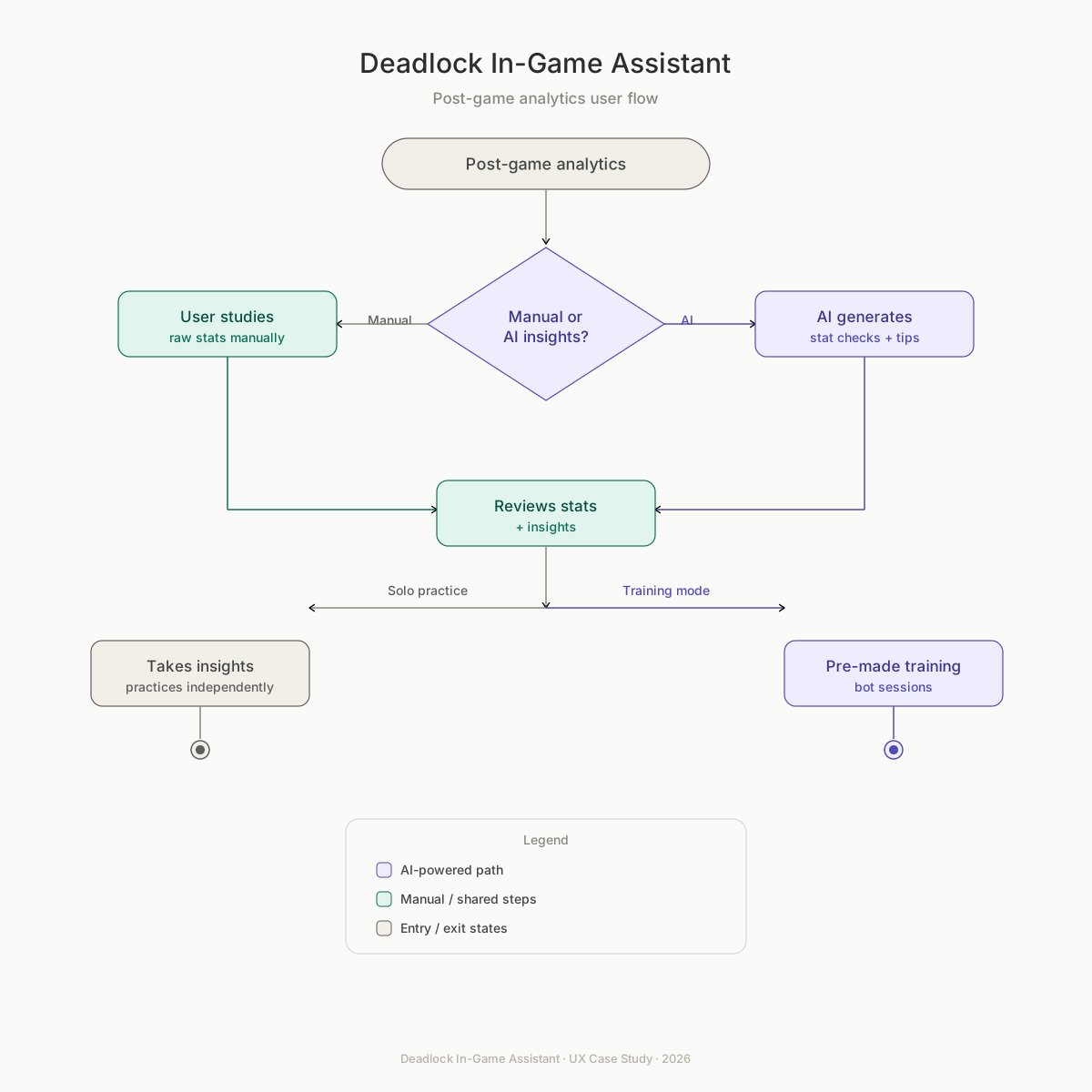
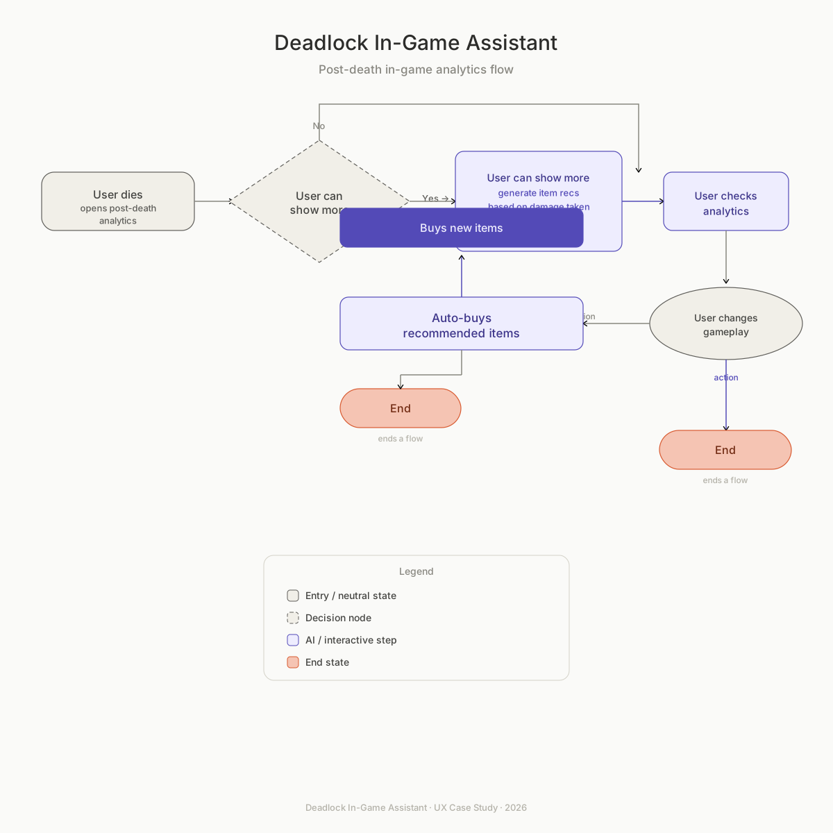
we mapped out two explicit screen-level software flows to address the distinct cognitive states of the player. ✦ flow a: post-game reflective learning loop triggers automatically upon match completion. rather than throwing senseless numbers at the user, the system automatically runs an analysis layer over the match telemetry, outputting prioritized, plain-language performance cards linked directly to custom interactive training drills. ✦ flow b: live post-death tactical response targets the 20-to-60 second downtime window directly following a player's death. the interface calculates the exact damage breakdown responsible for the death and lets the player instantly queue suggested defensive items into their active shop buffer with a single click, completely removing the need for mid-match menu-combing.
LAYOUT EXPLORATION & MATERIAL ITERATION
our initial drafts underwent radical changes when we confronted layout constraints and user feedback. we created over 15 distinct layout variations in figma to solve a primary conflict:


How do we display dense analysis without breaking the player's focus?
USER VALIDATION & TACTICAL FRICTION
We took our high-fidelity prototypes back to Kenny and Jeremey to see if our AI-curated layer actually solved their information overload. While both players praised the system for giving them clear, prioritized actions instead of a wall of raw numbers, their hands-on testing revealed critical environmental and cognitive friction points that we had to fix:
✦ The Environmental Disconnect: Kenny immediately noticed that the full-screen dashboard felt too detached from Deadlock's fast-paced, gritty visual style. He noted that it "felt like a separate analytics app" and recommended displaying the data directly over a blurred or live gameplay view so it felt native to the match world.
✦ The Gameplay Pressure Constraint: While Jeremey praised the color-coded severity matrix and the direct link to sandbox training drills, he raised a major concern about reading text under pressure. He noted that the "Reason" and "Suggested Action" blocks contained too much information for in-game use, warning that it would distract players during combat downtime.
✦ The Timing Gap: Both participants questioned when these screens would appear. Jeremey noted he would never open full menus while alive, but would highly value a completely automated "Death Analysis" layout that populated instantly during his post-death respawn window.

System Evolution
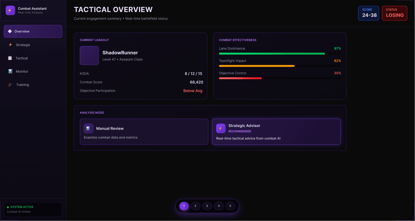
Our tactical assistant was originally built as an independent, full-screen dashboard app. User testing revealed this layout was a major failure. Both Kenny and Jeremey noted that a separate screen pulled them entirely out of the gameplay context and felt too overwhelming during active matches.
To fix this, we pivoted from an isolated dashboard to a native, embedded gameplay overlay for our final release.


✦ In-Game Interface: Shifted from a full-screen dashboard requiring multi-click tab navigation mid-match to a compact, one-column side-panel rendered directly on top of live gameplay. This keeps critical stats glanceable in under a second without pulling the player out of active match context.
✦ Post-Death Tracking: Replaced abstract stats listed in a separate menu window with an automated Death Analysis panel integrated cleanly into Deadlock's desaturated death camera view. This places plain-language cause data and damage-by-type graphs exactly where the user naturally expects them.
✦ Insight to Action: Pivoted from text-heavy recommendations telling you what item you should have bought to an interactive "One-Click Item Queue" button linked directly into the live item shop. This closes the learning loop instantly within the tight countdown window before respawning.
✦ Visual Hierarchy: Swapped a generic dark purple layout with clean panels that felt disconnected from the game world for atmospheric, game-matching dark tones using native typography. This leverages color familiarity (Red for Critical, Orange for Important, Blue for Moderate) for fast scanning under pressure.
CONCLUSION & REFLECTION
The biggest takeaway from this project is that good UX isn't about a constant addition of shiny bells and whistles — it's about dialing in a strong foundation into something great. Deadlock already had the data. Our job was simply to get it straight into the hands of the player. That clarity came from three hard lessons learned along the way:
✦ failure is a requirement: Our initial dashboard design was a functional failure because it didn't account for gameplay pressure. Embracing that harsh feedback from user testing is exactly what allowed us to pivot to a successful, context-aware layout for our final design.
✦ Context dictates layout density: There is a direct trade-off between interaction speed and data density. A player looking at a post-game screen has the mental breathing room to read detailed analysis, but an active match overlay must rely on hyper-glanceable, visual cues to avoid causing fatal distractions.
✦ Design is technical: This challenge wasn't a superficial visual redesign. It required diving deep into technical systems, analyzing data availability, and collaborating across disciplines to turn complex metrics into immediate, actionable user steps.